Most of the time, change is really really tough, especially in the world of marketing. You invest so much into creating and building a brand, fight for the recognition and remembrance, just to find out after a while that all that you’ve done needs a refreshment, or that it’s just plain boring and (already?) old :/
Although to us as marketeers the need for change comes much earlier than the real market needs (because we spend days and hours looking at the same design over and over again), when it comes to actually rolling out the changes to the public, it’s always a very tricky situation. Regardless of the research, focus groups and various tests a brand makes, it is in human nature to choose by intuition, by memory, in most of the cases even without too much thinking, and because of that, every small change can make a difference – and thus make the product adaptation more complicated.
This past months we saw two big changes – Coca Cola rolled out their new platform and design identity, and Pringles created a complete visual identity upgrade. And this is where the question arises, how big of a change in design is actually a big change in branding?
At first, most of the times it might look simple and insignificant, but if you look more closely, you will notice many carefully planned essential upgrades.
The Coca Cola Change: Real Magic
Coca Cola announced their project under the new platform “Real Magic”. I’m not very impressed with the first ad (even though I love that they decided to give so much space to gamers), but what really stood out in the whole launch was the adapted logo, presented as the “Hug Logo”.
The Coca Cola trademark followed the contours of the famous packages, giving a great illusion of a bottle or can, but also a super cool design. It doesn’t seem as a huge visual change, but the potential psychological effects are great. Whenever we see a Coca Cola creative we will also see the contours of the bottle, as if the logo and color were not enough, we will get even more thirsty for our favorite fizzy drink.
The Pringles Change: Mind Popping New Look
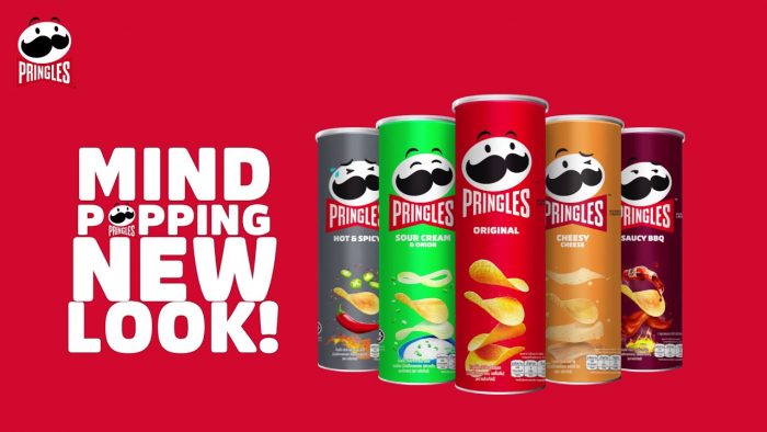
Pringles’ change, although involving a whole visual upgrade, gathered the most attention with the changes of the recognizable mascot, Mr. P. Not only was he modernized (or got a new styling as shown in the announcement ad), but he also got a whole new set of emotions as opposed to the regular smiling face.
And while we were all looking at the new “mind popping” minimalist visuals, once again, psychology played a great role in the background. By creating an array of emotions, Pringles has enabled an even more iconic position of their recognizable character by giving the logo itself an opportunity to communicate feelings and connect even more deeply with its audience.
So the answer is quite simple, small design change doesn’t mean small overall change. Even the smallest tweaks can make a huge difference. What’s your favorite design & brand update? 🙂
Read more of my thoughts here.