In their latest PR stunt Burger King published an article named “What idiot changed the Burger King logo?”. The idea of the article is to clarify the reasons for the burger king logo change, and at the same time try to stress the new brand story, quality and competitive advantages.
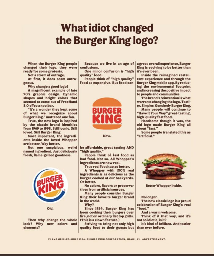
Although I can’t say it’s the best copy writing ever seen, I have to say I love the commitment of the team to the retro approach. Not only did they create an old-school looking logo, adapted the font and all the visual elements, the format of the article is created in a similar way as the first ads that were ever made. So it’s definitely worth the mention, and I’ll leave the discussion on which logo do you like more for another time 🙂
And while we’re here, take a look at the rebranding video explaining the new visual identity. I still can’t decide if the like the new identity but I definitely love this animation 🙂
Take a look at other fun and inspiring ads here: https://mktg.mk/category/inspiration/